Retail Packaging Design Guide: Stand Out on Shelves
Retail packaging competes for attention in a 3-second window. That is how long a shopper spends scanning a shelf before deciding what to pick up. Your packaging design needs to communicate brand identity, product value, and purchase motivation in that window. This guide covers the design principles, structural choices, and finishing techniques that win at retail.
Shelf Impact: The 3-Second Rule
At arm length (approximately 3-4 feet), most text becomes unreadable. What remains visible is color, shape, and the largest graphic elements. Effective retail packaging design works at three distances:
- Far (6+ feet): Color blocking and overall shape distinguish your product from the shelf noise. Bold color contrasts and unique structural formats catch the eye from across the aisle.
- Mid (3-4 feet): Brand logo, product name, and primary imagery become visible. These elements need to be large enough to read at this distance without squinting.
- Near (1-2 feet, in hand): Supporting copy, ingredients, certifications, and fine print. This is where you close the sale with specific product details.
Color Psychology in Packaging
Color is the first thing a shopper processes, even before shape or text. Research shows that up to 90% of snap judgments about products are based on color alone.
- Green: Natural, organic, health, sustainability. Dominant in wellness, organic food, and eco-friendly products.
- Black: Luxury, sophistication, premium quality. Used for high-end cosmetics, spirits, and designer goods.
- White: Clean, minimal, modern. Popular in skincare, tech, and contemporary food brands.
- Red: Energy, urgency, appetite. Common in food, beverages, and impulse purchase categories.
- Blue: Trust, reliability, calm. Used in healthcare, corporate, and technology packaging.
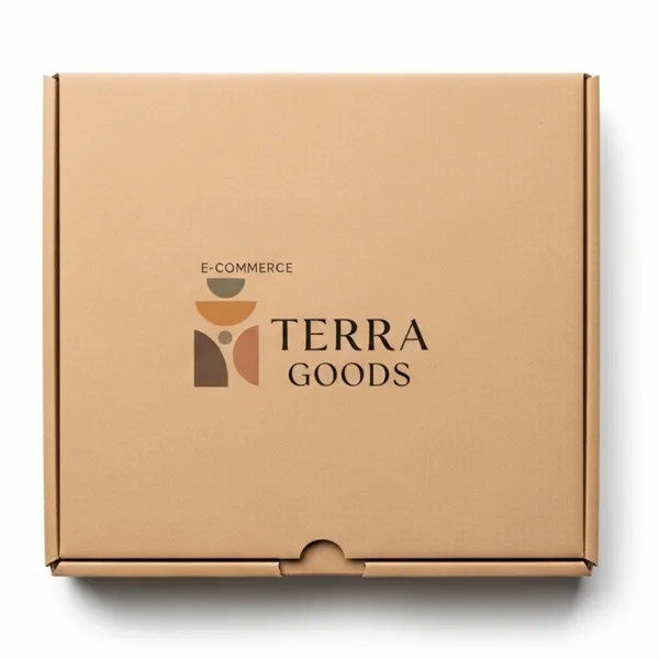
- Kraft brown: Authentic, artisanal, eco-conscious. Growing rapidly across all categories.
Importantly: differentiate from your competitors, not just your category. If every soap brand uses white and green, a matte black box with gold foil will stop scrolling thumbs and shopping eyes.
Typography That Sells
- Limit to 2 fonts maximum on the primary display panel
- Product name should be readable from 4 feet away minimum
- Use weight (bold, semibold) for hierarchy rather than adding more fonts
- Avoid decorative scripts for essential information like product name and net weight
- Ensure sufficient contrast between text color and background (test in grayscale)
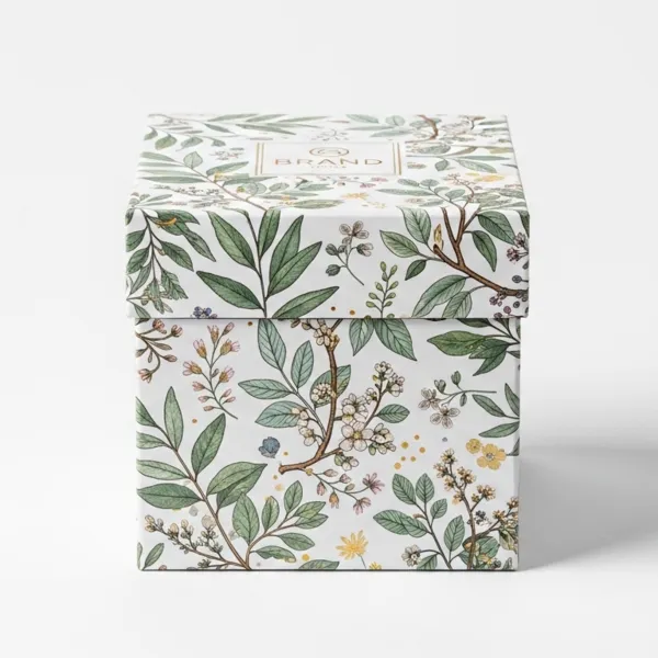
Structural Design for Retail
Window Patches
Die-cut windows with clear PET film let the customer see the actual product inside the box. Effective for food items, cosmetics, and any product where visual appeal drives purchase decisions. Window patches add approximately $0.05-$0.15 per unit.
Hang Tabs
Die-cut or adhesive hang tabs allow your packaging to display on pegboard hooks in addition to shelves. This doubles your retail display options at minimal cost. Euro-slot and butterfly-hole designs are the most common.
Counter Display Boxes
Point-of-purchase counter displays hold 6-24 units of your product at the checkout counter or register area. The display box itself is printed with your branding, turning a functional fixture into a marketing asset. Counter displays are particularly effective for impulse-purchase products under $20.
Shelf-Ready Packaging (SRP)
Also called retail-ready packaging, SRP is designed to go directly from shipping case to shelf without individual stocking. The shipping case opens or tears to become the display unit. Reduces labor costs for retailers and can improve your placement priority with buyers.
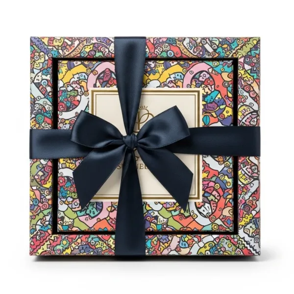
Finishing Techniques for Retail
- Matte lamination: Reduces glare under store lighting and gives a sophisticated, premium feel.
- Gloss lamination: Maximizes color vibrancy and creates eye-catching shine under fluorescent retail lighting.
- Spot UV: Selective gloss on matte backgrounds creates tactile and visual contrast that shoppers notice and remember.
- Embossing: Raised texture elements make the package feel different from competitors, encouraging the shopper to hold it longer.
- Foil stamping: Metallic elements (gold, silver, holographic) signal premium quality and justify higher price points.
Getting Your Retail Packaging Right
Teal Packaging produces custom retail boxes, display packaging, counter displays, and shelf-ready packaging for brands across every category. Start with our free design consultation: tell us your product dimensions, retail environment, and brand positioning, and we will recommend the optimal structural format and finishing combination.
- No minimum order quantity for any retail packaging format
- Free dieline design and artwork review
- FSC-certified materials with soy-based inks
- 7-day production turnaround
- Free shipping to US, Canada, UK, and Australia