
Key Takeaway
Designing cosmetic packaging starts with the dieline, the flat template that defines every panel, flap and bleed before artwork begins. Teal Packaging is a US manufacturer that builds the dieline free on every order: send a logo and brand colors, and the design team returns print-ready artwork with a digital proof and 2 revision rounds. Accepted files include AI, PDF and PSD at 300dpi. Volume pricing starts from about $0.44 per unit at scale. Suits founders designing their first skincare, makeup or haircare line.
Questions or ready for a quote? Contact Teal Packaging at info@tealpackaging.com or (224) 546-8325.
Design the structure first, then the artwork. Request a dieline for your exact carton size, build the art in layers on top of it, and keep foil, spot varnish, and die as separate spot color layers so a printer can separate them. Images need 300 ppi at final size, bleed runs 0.125 in, and brand colors should carry Pantone references rather than CMYK guesses.
Step one: get a dieline for the real size
A dieline is the flat map of your carton with cut lines, fold lines, and glue tabs marked. It comes from the finished inside dimensions, which come from the filled primary container, measured at its widest with the cap on. Never design on a generic template and hope the structure matches later. Dieline drafting is provided at no charge, so working from a guess makes no sense.
Step two: build the file in layers
| Layer | Contents | Setup | Common mistake |
|---|---|---|---|
| Dieline | Cut, crease, glue areas | Spot color, overprint on, non printing | Left as black and printed on the box |
| Artwork | Background, images, panels | CMYK plus named spot colors | Missing bleed at trim edges |
| Type | All copy | Outlined fonts, single ink for small text | 6pt copy built from four plates |
| Foil | Areas to be stamped | 100 percent of one spot color, named Foil | Gradients and hairlines in the foil layer |
| Spot varnish | Areas to gloss | Separate spot color, named Spot UV | Varnish shapes finer than 2pt |
Step three: settle color before you fall in love with a screen
Monitors are backlit and paper is not, so a color chosen on a display will look darker and flatter in hand. Pick brand colors from a printed Pantone reference viewed under normal room light. For photographic images stay in CMYK and accept that the brightest oranges and blues will shift. If one brand color has to hold across a lip product carton and a serum box produced months apart, specify a spot ink rather than a build, and write the reference into the purchase order.
Step four: respect what foil and emboss can hold
- Hot foil holds clean edges at about 8pt type and above; smaller than that, the counters fill.
- Keep foil away from fold lines, because the metallic layer cracks along a crease.
- Emboss wants bold, simple shapes; a fine serif logo turns to mush on 18pt board.
- Registration between foil and print has a tolerance, so avoid designs where foil must land inside a printed outline with no gap.
- Soft-touch laminate under a spot gloss gives the strongest contrast for the money on a dark carton.
Step five: leave room for the copy you have not written
Regulatory copy, batch codes, and whatever symbols your team uses arrive late and always need more room than expected. Reserve a defined block on the back or side panel at the start, sized generously, rather than squeezing text in at proof stage. Which statements apply to a cosmetic product belongs to your own regulatory advisor. Your job in the design file is to keep that block legible, in a single ink, clear of scores and glue tabs.
Step six: proof on paper, twice
Read the digital proof at 100 percent on screen and check spelling, dimensions, and layer separation. Then print it at actual size, cut, fold, and tape it, and put the real bottle inside. That second step catches the errors that matter: a panel that reads sideways, a lid that hides the logo, an insert that fouls a pump. Nothing prints until you approve the proof, so work both rounds properly instead of approving quickly and discovering the problem on a pallet.
Step seven: plan the run before the design is final
Quantities affect design choices. Design a carton and buy 50 of it, or 100 if the build is specialty rigid, which makes a small first run practical for testing shelf presence. Digital printing suits short runs with no plate charges, while flexographic and litho work get cheaper as quantity climbs, so knowing your target quantity early tells the designer how many colors and passes are realistic. If a shade family is planned, share one die across every variant and change only the printed panel.
Step eight: build a shade family from one die
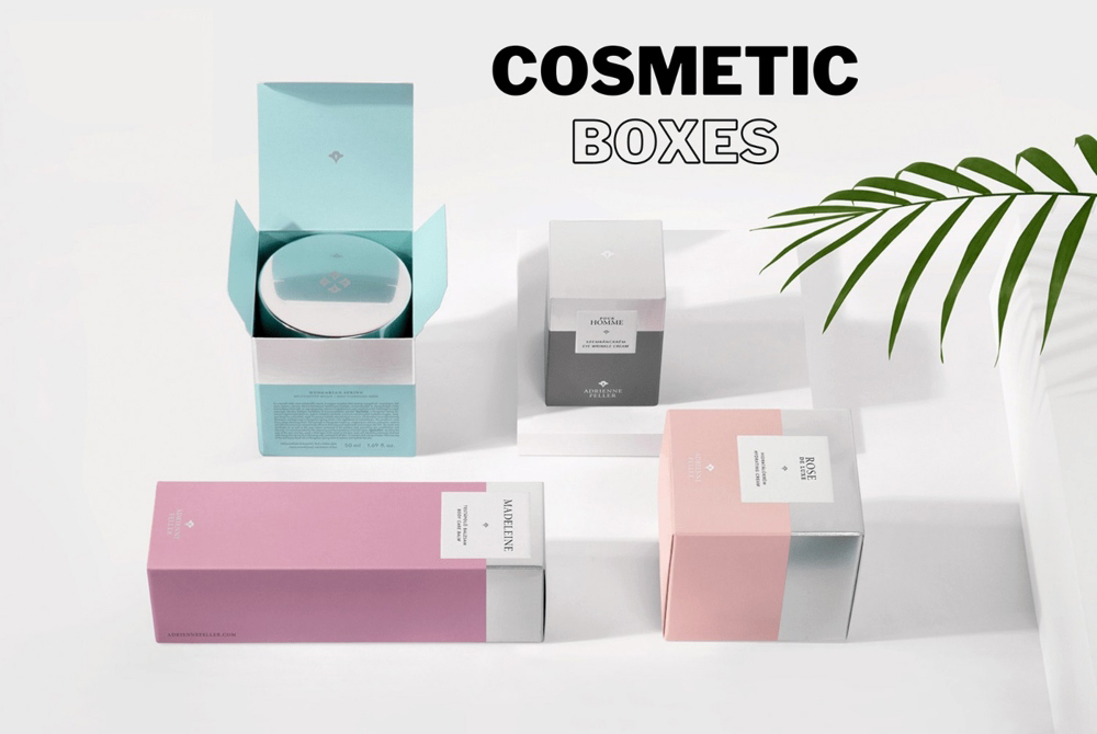
A six shade line does not need six structures. Keep one carton size and one die, then change the printed panel per shade. That keeps one die in use, keeps your warehouse holding one dimension, and makes a seventh shade a print file rather than a project. Give each shade a clear identifier on the same position of the same panel so a stock picker can read it from a shelf edge without lifting the box.
Files that get sent back
- Images placed in RGB, which shift when converted late in the process.
- A logo pulled from a website at 72 ppi, which cannot be enlarged.
- Spot colors named inconsistently across layers, so two plates get made for one ink.
- No separate foil or varnish layer, leaving a printer to guess which shapes are which.
- Artwork built on a template that does not match the quoted structure.
- Layers merged into a single flattened image, which strips the die and varnish information entirely.
- Barcodes supplied as a low resolution picture instead of vector, which scanners struggle to read.
Production sites and the schedule
US work is produced at West Chicago, Illinois, with Guangzhou as the second option, and every order is routed by construction and quantity. Eligible in-house production can land inside seven business days of approval; specialty imported work needs about twelve weeks. Both are planning ranges. Shipping in the US costs nothing extra, and the sample pack at $50 is credited to a first custom order, the least expensive way to compare board weights and finishes while artwork is still moving. Structures by format appear on the cosmetic packaging pages.

Ben Russell
Ben is a Senior Packaging Strategist and writer at Teal Packaging, covering packaging materials, design strategy, and practical branding insights.